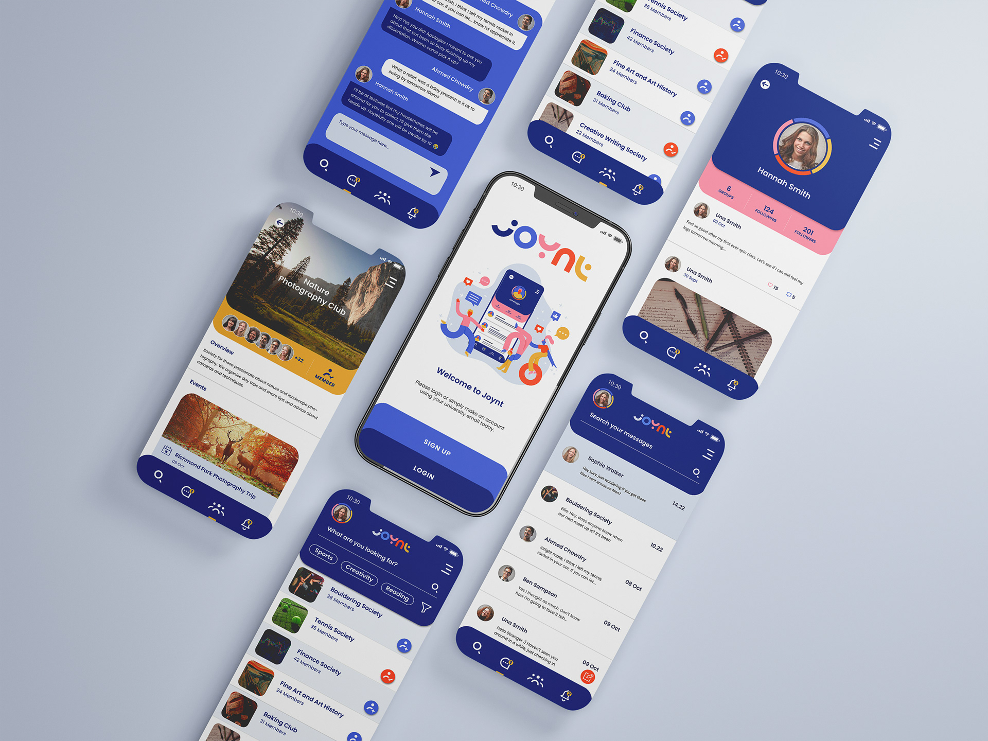
The brief was to create a logo and UI design concepts for an app designed to foster connections among students with shared interests through groups and societies. The name combines 'Joy' and 'Joint,' and I integrated this concept into my designs. In line with my client's vision, I prioritised clean, uncluttered designs with a distinct personality, punctuated by pops of colour and a playful custom logotype and illustration. These elements were crafted to resonate with young adults, reflecting the vibrant spirit of the target audience.

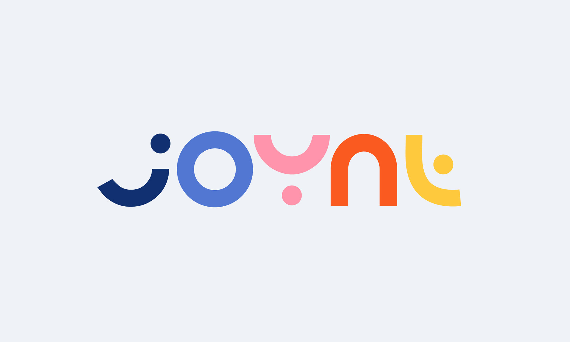
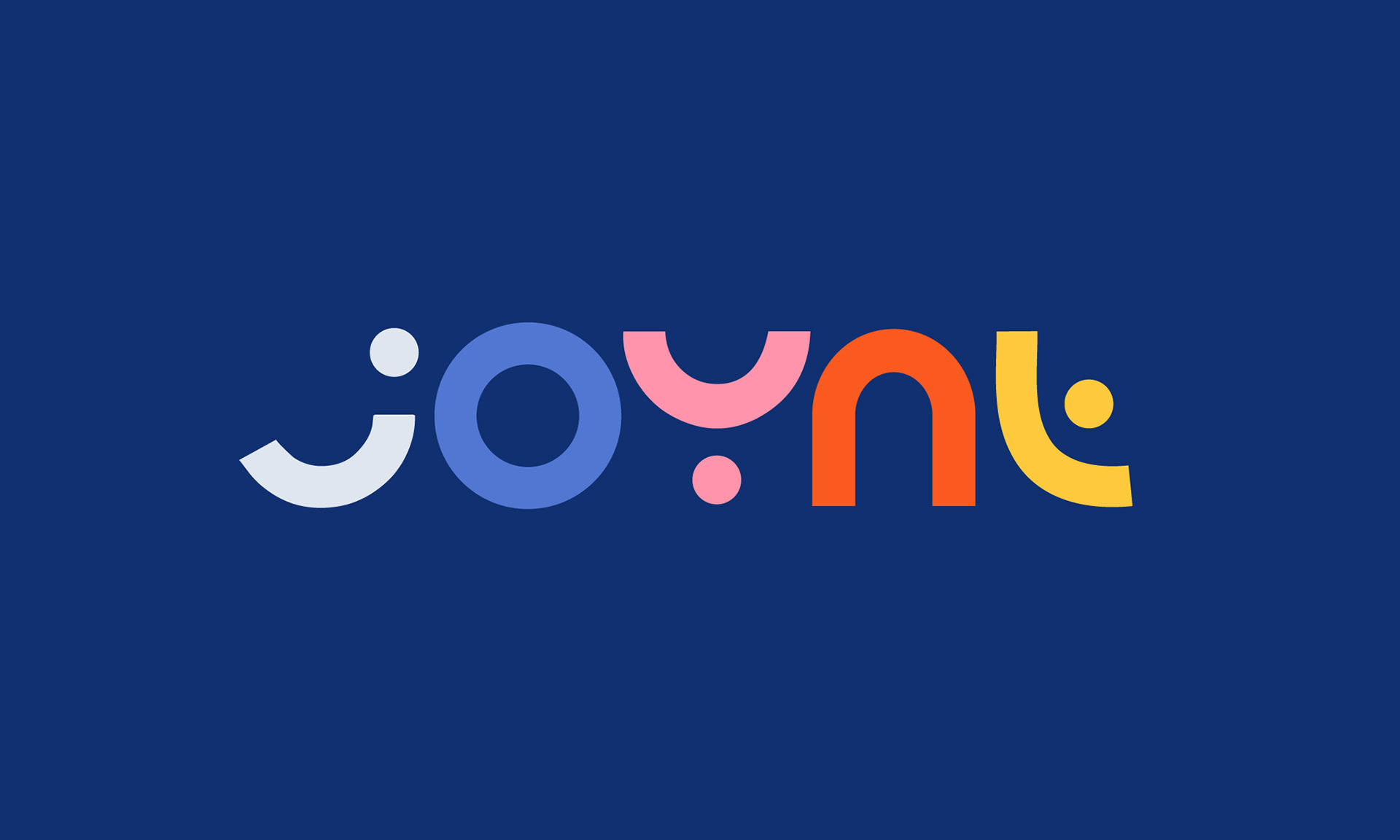
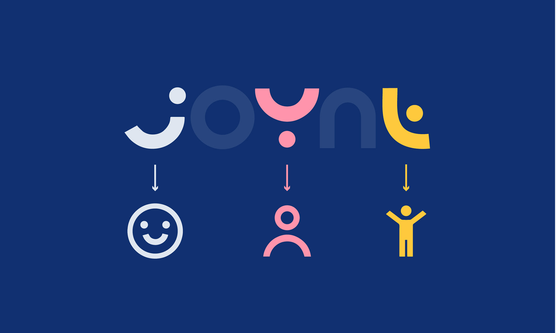
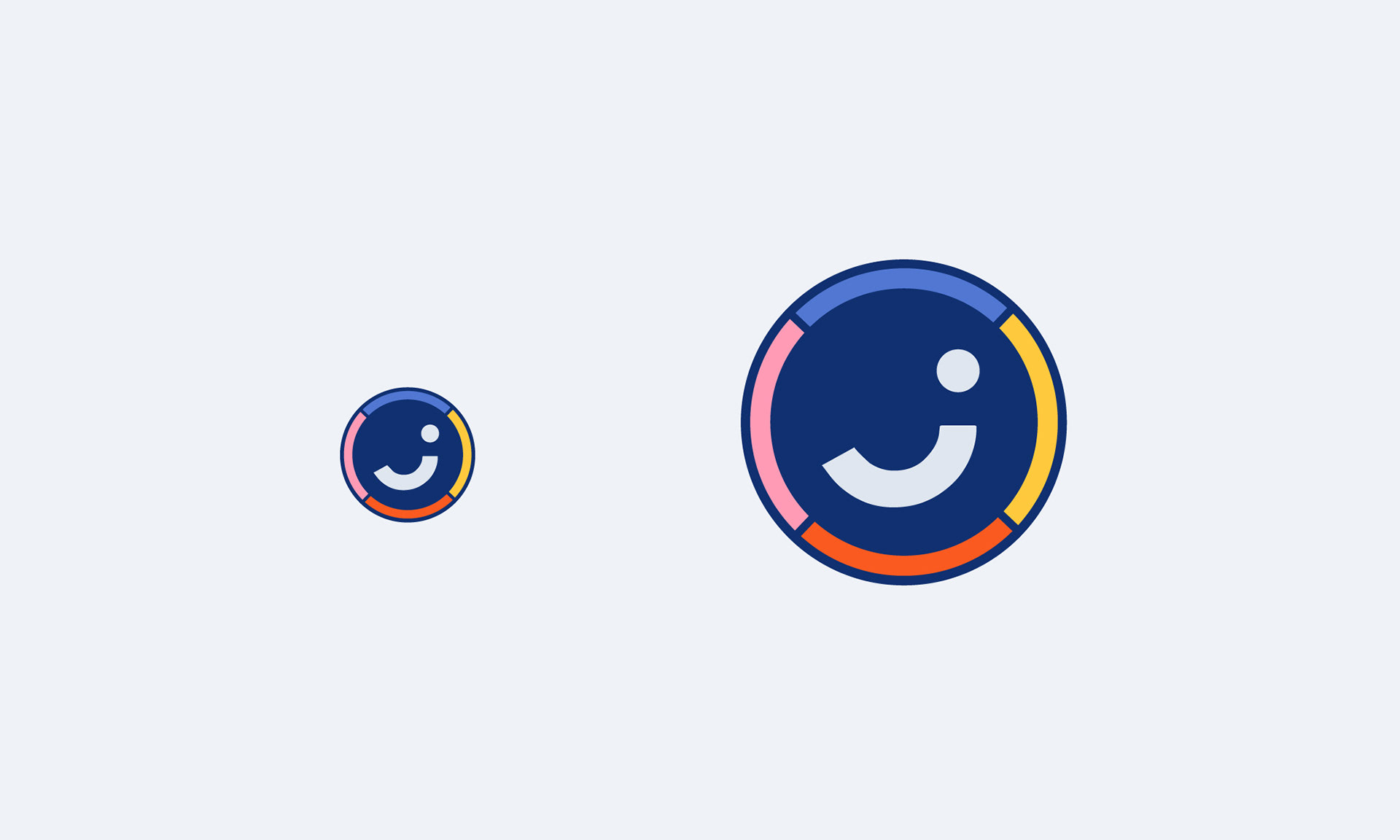
Logotype and Favicon
Incorporating a bright colour palette and abstract shapes, I aimed to infuse the concept of 'Joy' into the custom logotype, while subtly nodding to social media. The resulting design not only embodies the essence of 'Joy' but also mirrors the app's ethos of connectivity and inclusivity.
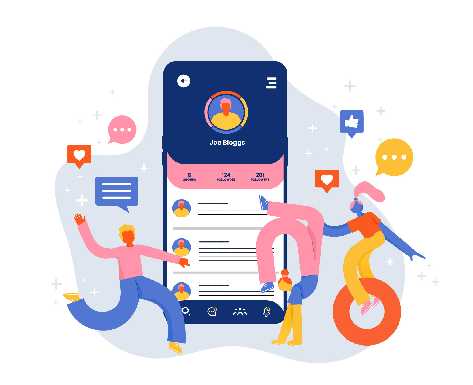
Custom Illustration:
I utilised the shapes from the logotype to craft a captivating and welcoming illustration for the initial sign-in page. This illustration serves as an inviting visual element, enticing users to engage with the app. Additionally, it can be repurposed across various marketing materials to encourage more sign-ups and promote user growth.
UI Design
I created 6 pages to display how the UI could work.