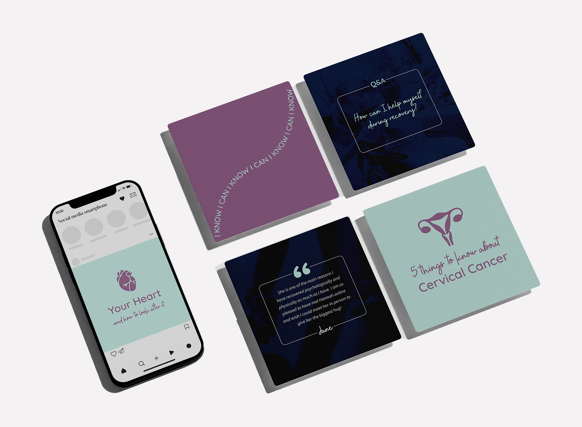
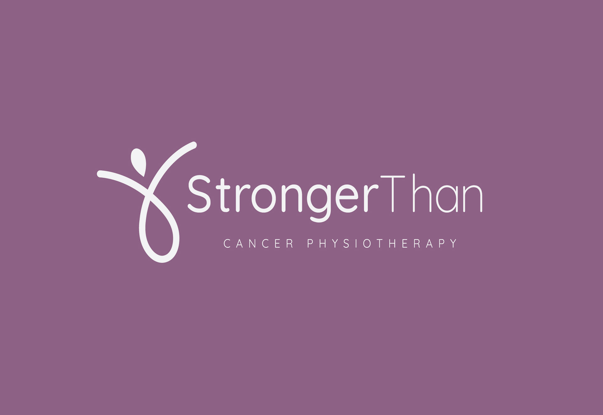
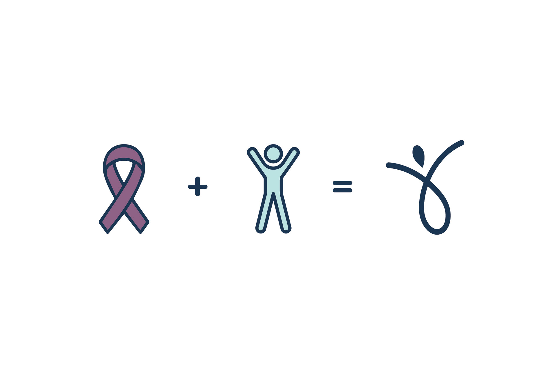
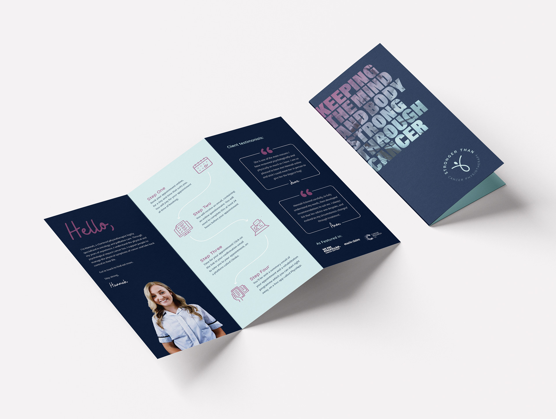
Stronger Than is a company dedicated to providing physiotherapy services to cancer patients. This project presented a unique challenge, as the branding needed to strike a delicate balance between being welcoming and friendly while addressing the heavy subject matter of cancer. The goal was to create a visual identity that conveyed strength, support, and resilience, without being overly clinical or overly bright and cheerful. The resulting branding embodies a sense of warmth and encouragement, reflecting the inner strength and determination of cancer patients on their journey to wellness. Overall, the branding reflects the compassionate and empowering approach of "Stronger Than" in supporting individuals through their cancer treatment and recovery process.
Logo Design:


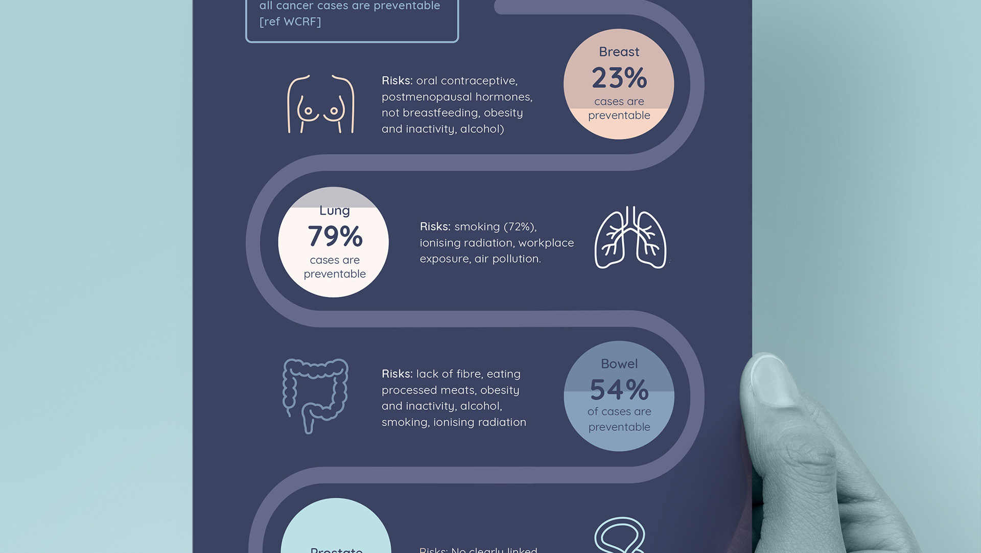
Brochure design:
Instagram posts:Design: